Design System
Schweitz Design System
A lightweight, token-driven design system built with atomic methodology. Every component enforces WCAG AA 2.2 compliance, supports light and dark modes, and uses logical CSS properties for RTL readiness.
Colors
All colors are defined as OKLCH values in CSS custom properties, enabling perceptually uniform light/dark mode transitions. The neutral palette is inherited from shadcn/ui; the brand palette extends it with a warm amber accent.
Semantic Palette
Background
--background
Foreground
--foreground
Card
--card
Card Foreground
--card-foreground
Primary
--primary
Primary Foreground
--primary-foreground
Secondary
--secondary
Secondary Foreground
--secondary-foreground
Muted
--muted
Accent
--accent
Accent Foreground
--accent-foreground
Destructive
--destructive
Border
--border
Input
--input
Ring
--ring
Brand Tonal Scale
Brand Semantic Tokens
Brand
--brand
Brand Foreground
--brand-foreground
Brand Primary
--brand-primary
Brand Primary FG
--brand-primary-foreground
Brand Muted
--brand-muted
Brand Hover
--brand-hover
Focus Ring
--focus-ring
Focus Outline
--focus-outline
Typography
Headings use Fraunces, a variable serif display font, rendered in the brand amber color for visual hierarchy. Body text uses Geist Sans and code uses Geist Mono. Sizes are defined as CSS custom properties and consumed via design system atoms.
Font Families
Fraunces
Variable serif display font used for all headings. Paired with the brand amber color for visual hierarchy.
--font-serif · font-serif
Geist Sans
Clean sans-serif used for body text, UI elements, and all non-heading content.
--font-sans · font-sans
Scale
Display (Fraunces)
3rem (48px) · --font-size-display
H1 (Fraunces)
2.5rem (40px) · --font-size-h1
H2 (Fraunces)
1.75rem (28px) · --font-size-h2
H3 (Fraunces)
1.375rem (22px) · --font-size-h3
H4 (Fraunces)
1.25rem (20px) · --font-size-h4
Body Large (Geist Sans)
1.125rem (18px) · --font-size-body-lg
Body (Geist Sans)
1.0625rem (17px) · --font-size-body
Small (Geist Sans)
0.9375rem (15px) · --font-size-small
Caption (Geist Sans)
0.8125rem (13px) · --font-size-caption
Overline (Geist Sans)
0.75rem (12px) · --font-size-overline
Weights
Ag
Semibold (600)
Ag
Bold (700)
Line Heights
The quick brown fox jumps over the lazy dog. This sentence demonstrates the line height in context.
Tight · 1.2 · --leading-tight
The quick brown fox jumps over the lazy dog. This sentence demonstrates the line height in context.
Snug · 1.3 · --leading-snug
The quick brown fox jumps over the lazy dog. This sentence demonstrates the line height in context.
Normal · 1.5 · --leading-normal
The quick brown fox jumps over the lazy dog. This sentence demonstrates the line height in context.
Relaxed · 1.7 · --leading-relaxed
Letter Spacing
Ag
Tight (-0.025em)
--tracking-tight
Ag
Wide (0.025em)
--tracking-wide
Ag
Widest (0.1em)
--tracking-widest
Spacing
A consistent spacing scale based on 4px increments. Used for padding, margins, and gaps throughout the system.
Radius
A simplified radius scale with five steps, from sharp corners to fully rounded.
Small
6px
Medium
10px
Large
16px
Full
9999px
Shadows
Four shadow levels for depth, with darker variants automatically applied in dark mode.
XS
--shadow-xs
SM
--shadow-sm
MD
--shadow-md
LG
--shadow-lg
Transitions
Standardized durations and easing curves. All transitions respect prefers-reduced-motion and are disabled when the user prefers reduced motion.
Durations
Easing
Components
Live examples of design system atoms, molecules, and organisms. Components use CVA for variant management and cn() for class merging.
Headings
Display
Heading 1
Heading 2
Heading 3
Heading 4
Text
Body Large — primary text
Body — default text
Small — secondary information
Caption — labels and metadata
Overline — category labels
Body — muted tone
Body — brand tone
Badges
Links
Buttons
Form Field
Metric Cards
- +42%
- Conversion rate
- $2.3M
- Revenue impact
- 4.8
- App store rating
Callout
"All the end of study is to make you a good man and a useful citizen."
Device Frames
Lightweight browser and phone chrome components for presenting UI screenshots with context. Support static (aspect-ratio) and scrollable (fixed-height viewport) modes.
Browser — static
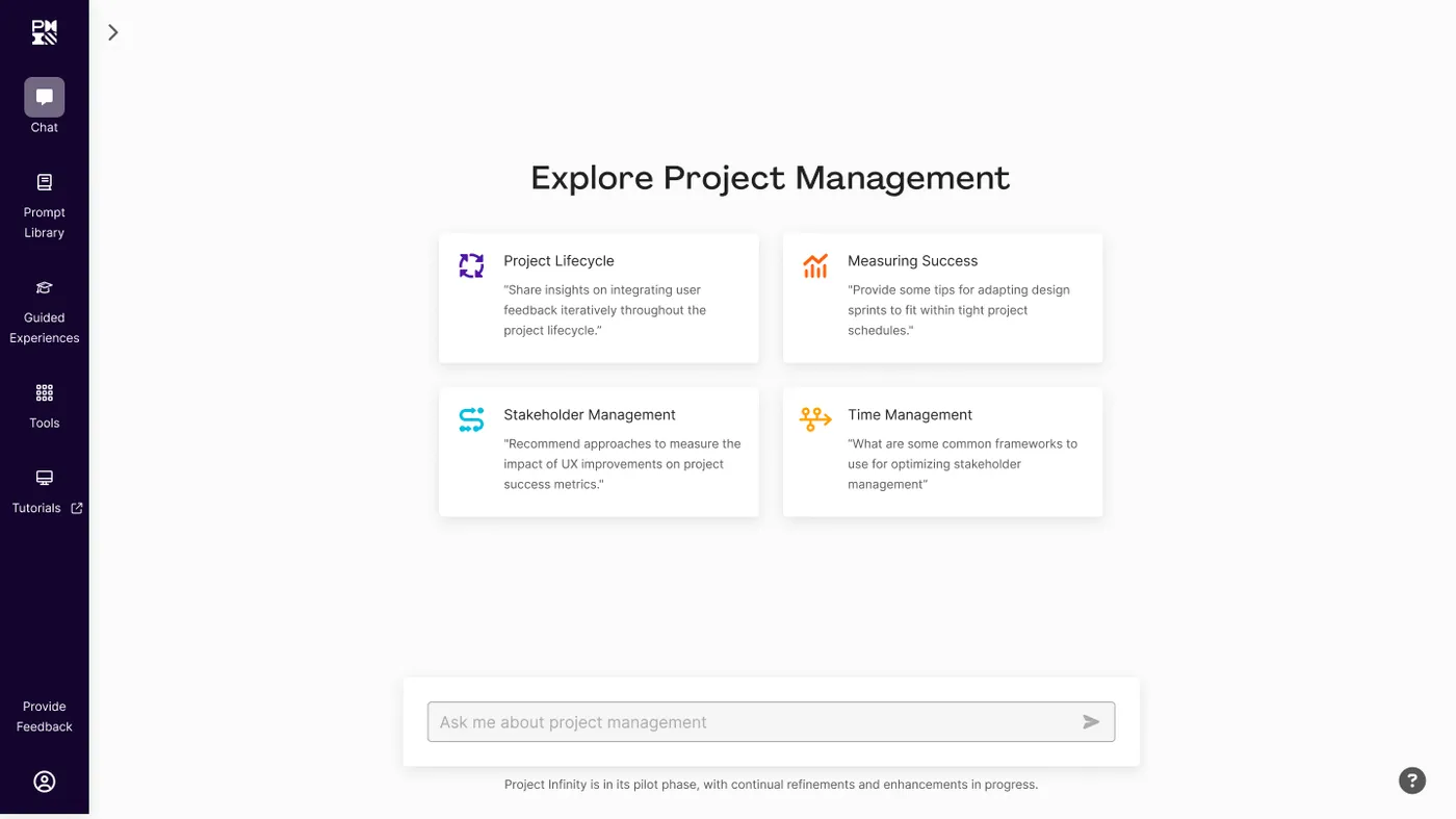
Browser — scroll
Phone — static
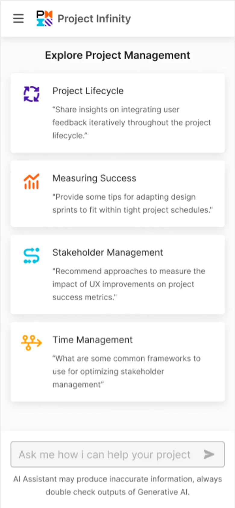
Phone — scroll
Device Carousel
A carousel that shows one framed device image at a time with prev/next navigation, dot indicators, and a click-to-zoom lightbox. Built on embla-carousel and Radix Dialog.
Code
Use var(--brand) for the brand accent color.
:root {
  --brand: oklch(0.65 0.16 60);
  --brand-foreground: oklch(1 0 0);
}
Accessibility
This site targets WCAG AA 2.2 compliance. Accessibility is not a separate feature — it is baked into every token, component, and layout decision.
Compliance Statement
zachschweitzer.com is designed and built to conform to the Web Content Accessibility Guidelines (WCAG) 2.2 at Level AA. All color pairings meet minimum contrast ratios, all interactive elements are keyboard-operable, and all images include descriptive alt text.
Color Contrast Matrix
Every semantic color pairing is validated against WCAG AA contrast thresholds (4.5:1 for body text, 3:1 for large text and UI components).
Foreground
Body text sample at this size.
Card Foreground
Body text sample at this size.
Primary Foreground
Body text sample at this size.
Secondary Foreground
Body text sample at this size.
Secondary Foreground
Body text sample at this size.
Accent Foreground
Body text sample at this size.
Brand Foreground
Body text sample at this size.
Brand
Body text sample at this size.
Brand
Body text sample at this size.
Focus States
Inspired by the GOV.UK design system, all interactive elements use a dual-cue focus pattern: a thick 3px brand amber --focus-ring inner ring paired with a 2px contrasting --focus-outline outer outline (dark in light mode, light in dark mode). This exceeds WCAG AA minimums and ensures focus is visible on any background. Try tabbing through these elements:
Keyboard Navigation
| Key | Action |
|---|---|
Tab | Move focus to next interactive element |
Shift + Tab | Move focus to previous interactive element |
Enter / Space | Activate buttons and links |
Escape | Close dialogs and mobile menu |
Arrow keys | Navigate within composite widgets (menus, tabs) |
Semantic HTML
Every component uses the most semantically appropriate HTML element, providing meaning to assistive technologies beyond visual presentation.
| Element | Usage |
|---|---|
<nav> | Site navigation with aria-label |
<main> | Primary page content |
<article> | Self-contained content (about page, project cards) |
<section> | Thematic groupings with headings |
<figure> / <figcaption> | Images with captions |
<blockquote> / <cite> | Testimonials and callouts |
<dl> / <dt> / <dd> | Case study metadata (role, year) |
Screen Reader Annotations
ARIA attributes provide additional context where visual cues alone are insufficient.
| Attribute | Usage |
|---|---|
aria-label | Icon-only buttons (e.g., mobile menu toggle) |
aria-current="page" | Active navigation link |
aria-invalid | Form fields with validation errors |
aria-describedby | Error messages linked to form fields |
aria-hidden | Decorative icons and visual-only elements |
role="alert" | Validation error messages (announced immediately) |
Reduced Motion
When prefers-reduced-motion: reduce is active, all animations and transitions are disabled site-wide via a global CSS rule.
Image Alt Text Guidelines
Every image on the site includes descriptive alt text. The design system enforces this through required alt props on all image components.
Presence does equal quality. Alt text must convey the author's purpose for including the image and the full breadth of information the image conveys in it's context.
| Image Type | Alt Text Approach |
|---|---|
| Cover images | Describe the purpose of the image relative to the case study |
| UI screenshots | Describe the interface state or feature shown |
| Photos | Describe the scene, location, and context |
| Illustrations | “[Concept] illustration” |
| Decorative | aria-hidden="true" (no alt text) |